Thursday, June 21, 2012

Why You Need A Paint Color Plan

Whether I was there as a color consultant, painting contractor or professional stager, over the years I've been in thousands of homes of every size, style and price range. 
One of the most common mistakes I encounter in homes of all types, is a piecemeal approach to choosing interior colors. Although I'm a big fan of evolving design that showcases your personal style vs. the installed by a decorator look, color is a design element that needs to be coordinated throughout the house for the best result. 


Why You Need a Color Plan
Without an overall color plan, a house lacks harmony and unity. Conflicting or unrelated colors are not only unattractive, they can be uncomfortable to live with because they're disconcerting. Consider this example I saw recently: the daughter's room had bright pink walls, the son's room was black, the kitchen was a sunny yellow and the rest of the house was beige. The result was color chaos! When you're selling, badly chosen (or badly coordinated) colors can decrease its value and marketability. 


Even if you paint your house a little at a time, it's wise to develop an overall plan. If you've already done a lot of painting, analyze what's working and what isn't, create a plan, then make adjustments as your time and budget allow. 


Here are some simple "do's" and "don't's" for creating your color plan: 


DON'T cop out completely by painting everything white. That's an opportunity lost and a poor choice for many homes.


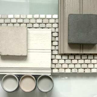
DO start with the colors in the permanent elements (floors, carpets, counter tops, stonework, tile, etc.).


DO use several colors for variety and interest.


DO consider using lighter and darker versions of the same colors.


DON'T use both tint colors and shade colors on the walls. They're different concepts, so pick a team and play on it.   Tints and Shades


DO learn about light reflectance values (LRV) so you can compare colors accurately. Here's a short explanation from our web site:  Light Reflectance Values (LRV)


DO repeat colors to create unity and harmony. For instance, the living room color might also work well in a powder room. 


DO use a single color on the trim to tie the plan together.


DON'T accent baseboards or crown molding smaller than four inches wide, especially in homes with eight foot ceilings. Instead, paint them in the wall color so that instead of drawing attention, they become texture and improve the proportions of the room.


DO consider painting bathroom vanities in accent colors. This is a very cost-effective way to add personality. 


DO consider a special color for some ceilings, such as the dining room.


DON'T automatically paint ceilings white, especially when you've chosen earth tones for the walls. They'll look out of place with the wall color, or as if you forgot to paint them.


DO consider painting the back walls of shelves in accent colors.


DO use color to tweak the architecture. Use an accent color on the end wall of a long hallway to minimize the "bowling alley" impression. 


DO consider using darker, richer colors in some areas, such as a media room.


DO use blocks of color to help define areas in large, open spaces.


DO consider the room's sun exposure when you're choosing colors. If the room faces north, warm colors are a good idea to counteract a cold, gray feeling.


DON'T make color decisions from a tiny paint chip or color strip. They don't tell you what a color really is like. Instead, create 2x3 foot sample boards using inexpensive foam core, and look at the samples under different light conditions.


DO view the samples in the orientation the color will be applied. If you're choosing a ceiling color, tape the sample to the ceiling.


DO create your own design book with samples of paint, fabric, tile, etc. Carry it in the car so you never have to guess if something will work with what you have. Our ability to remember color accurately is faulty.


Have fun with color when you're creating your space, but take the time to do a little planning before you paint. If you need help, call me at (828) 692-4355 to schedule a color consultation. 


Tuesday, June 5, 2012

Smarter Painting Estimates

As professional painting contractors who know what it takes to do our work properly, Roger and I often find it frustrating that many people think all painters are created equal, and can't see beyond finding the lowest bid. We understand that getting good value for your investment is important, and it is to us too, but we want you to know that a low bid may wind up being a bad bargain.

Many states, including North and South Carolina, have no licensing requirements, or proficiency standards. As a result, there will be significant differences in knowledge, skills and professional work practices among those who bid your project. Today people seeking work as painters often include students who need a summer job, and others who are painting because they can't find employment in their regular occupation. Most have no training and don't particularly like to paint, so what kind of work can you expect from them, especially when they've given you a low bid? Not only that, it's highly likely that each person who gives you an estimate will see the work differently, or not understand it, and you'll wind up trying to compare proposals, not knowing which approach makes the most sense.

We'd like you to consider a new way to get painting estimates. It involves more work, but it will help ensure that the job that gets done is the right one, and it will give you an objective way to compare estimates.
  • Take pictures of what you want to have painted and print them with your color printer (plain paper is fine).
  • Bring the pictures to the expert at your local paint store and discuss your project, including details about the condition of your house, and any plans you have for color changes.
  • Ask for guidance on:
    • preparation needed
    • number of coats to be applied
    • best method of application
    • recommended materials for the job.
  • If feasible, plan to buy your own materials and major supplies and get an estimate of quantity and cost. 
  • Get contractor recommendations from people you trust, and schedule appointments to do an estimate. Keep in mind that painting the interior of an occupied home requires much greater skill and care than exterior painting.
  • At the time of the estimate, pay attention to how the contractor presents himself, and look at his vehicle. You'll learn a great deal about his work habits...
  • Pay attention to how carefully the contractor inspects the job. Is he thorough? Does he take notes, measure, examine the condition of the surfaces, take pictures or sketch, ask questions?
  • Give your scope of work to each bidder, along with a form on which to submit their bid. 
  • The form should include a payment schedule, plus insurance, clean-up and any other requirements you have.  It also should include the stipulation that by submitting a bid they agree to complete the scope of work to your satisfaction, and comply with the other requirements.
  • If the contractor will have employees on the job, require evidence that he carries workers' compensation insurance, and that coverage is in effect.
  • Tell each bidder to bid the basic job per the scope of work, and to price any options or recommendations separately.
  • Instruct them to include only equipment charges (such as for pressure-washing), incidental supplies and labor in their basic estimate.
Now you have a sensible way to compare the estimates, and you have control over payment.

Even if it's not feasible for you to follow all the steps that I've outlined, particularly for smaller jobs, at least take the time to develop a better idea of what you want to accomplish. If you can discuss the work knowledgeably and in detail, bidders can prepare estimates on the same basis. This step alone can help you avoid some of the common pitfalls when comparing painting estimates, so that you're likely to have fewer problems and results that meet your expectations.

Beware of an unusually low bid because it normally means the bidder:
  • didn't understand the scope of work
  • intended to take shortcuts, usually in the preparation phase
  • uses unskilled or temporary labor and pays them cash
  • plans to use lower grade materials
Painting done well can have a significant, positive effect on the value and enjoyment of your house, far beyond what the work costs, so it's worth hiring the right people and doing things the way they should be done.

If you would like to have your painting done by a professional you can rely on, call me to schedule an estimate at 828-692-4355.  


Friday, June 1, 2012

Choosing A Front Door Color - A Baker's Dozen Mistakes to Avoid


If you're one of the many people who think of your front door as just another piece of trim, instead of a design element that deserves special consideration, think again. If you don't make a wise choice about what color to paint it, you'll not only waste a crucial opportunity to add style and impact, and you might even detract from the potential curb appeal of your house. There's a lot at stake.


Here are some common mistakes to avoid when choosing a color for your front door:

#1-This Garage Door Has Won
  1. Letting the garage door "win".  In many houses, the garage door(s) and front door can be seen at the same time. If you call attention to the much larger garage door(s) by using the trim color, you've made it/them dominant and exaggerated your design and curb appeal problems. Think of it this way: Which is more important - the front door, which is the natural focal point and where you welcome people, or the garage door(s) where the cars live? The way to give your front door prominence and de-emphasize the garage is to paint the garage doors(s) in the wall color (assuming it can be done without voiding the warranty), causing them to recede into the background. Make your front door stand out by painting it a special color that appears nowhere else.
  2. Painting the front door in your favorite color, whether or not that's a good idea. I've seen a few bright pink front doors, and none did the house any favors.
  3. Using a color just because you liked it on someone else's house. What may be right for their house isn't necessarily right for yours. 
  4. Failing to consider your location. Colors that are attractive at the beach, probably won't work as well in the city or in the mountains. 
  5. Ignoring the architecture of your house. Many colors that suit the front door of a cabin aren't the best choices for a modern house or a Colonial. 
  6. Failing to coordinate all the paint colors with the colors in the permanent elements, such as the roof, stonework or vinyl windows. The permanent elements should be the starting point for creating your color plan. One of the most common problems I see is vinyl windows, especially pure white ones, that weren't considered when the wall and trim colors were chosen, and are so out of place and high contrast that they ruin the look of the house.  
  7. Ignoring the colors in your landscaping, especially the evergreens and flowering plants. Don't choose a bright red front door if your landscaping features pink and purple rhododendrons.
  8. Choosing a front door color that doesn't coordinate well with the wall and trim colors. Your color plan must be unified to be attractive, and if one of the elements doesn't work, the plan fails. See #9 for one example of this problem.
  9. Combining tint colors with shade colors (see my earlier post on  Mixing Tint Colors with Shade Colors). There are tint and shade versions of most hues, so, yes, you can still have a yellow front door. Just be sure you use the right yellow.
  10. Not considering the overall impression you want to create. Do you want elegance, drama, warmth, historic accuracy? The front door color is the one that sends the key message.
  11. Failing to paint the screen door or storm door in the same color as the front door (and choosing a design that conflicts with the front door, or hides its features). You haven't accomplished much if you buy a beautiful front door, paint it an attractive color and then undermine the look with the screen or storm door design and color.
  12. Outlining or accenting parts of the door. Use a single color to avoid a busy, chaotic look. 
  13. Making color decisions from a paint strip or small chip instead of a large sample. You won't know what a color really looks like if you work from a chip or a strip.

    # 11  - Over-accenting


#2-Someone's favorite color.


#7 - Tint and shade combination

Paint Sheen
The sheen of the paint you use is also important. The higher the sheen, the more intense the color becomes and the more every little flaw will show. High gloss paints are best reserved for new doors, or ones that are in perfect condition. If your front door is less than perfect, choose a low sheen enamel. Sheen names vary by manufacturer and product line, so talk with the experts at the paint store about the best choice for your door.

Paint Quality
Quality matters. The front door is the most important design element in the front of your house, so don't skimp. If you use cheap paint and don't take the time to prepare the door correctly by cleaning, patching, caulking, sanding and priming as needed, then applying at least two finish coats, the door won't look its best and it won't enhance the value of your house. Given the cost of many front doors, having it professionally painted it is a wise investment. 

Want a Beautiful Front Door? Call Us!
We're known for very high quality finish work. If you have a front door to paint or stain, including cosmetic repairs, or an entire house to paint for that matter, call me to schedule an estimate. If you choose us to do the work, a color consultation with me is a free part of our service.

You can reach me at 828-692-4355.