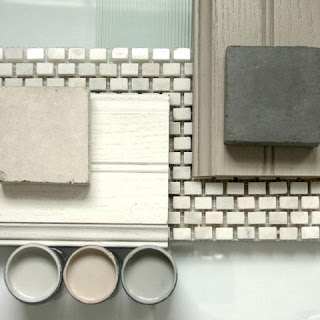
Whether I was there as a color consultant, painting contractor or professional stager, over the years I've been in thousands of homes of every size, style and price range.
One of the most common mistakes I encounter in homes of all types, is a piecemeal approach to choosing interior colors. Although I'm a big fan of evolving design that showcases your personal style vs. the installed by a decorator look, color is a design element that needs to be coordinated throughout the house for the best result.
Why You Need a Color Plan
Without an overall color plan, a house lacks harmony and unity. Conflicting or unrelated colors are not only unattractive, they can be uncomfortable to live with because they're disconcerting. Consider this example I saw recently: the daughter's room had bright pink walls, the son's room was black, the kitchen was a sunny yellow and the rest of the house was beige. The result was color chaos! When you're selling, badly chosen (or badly coordinated) colors can decrease its value and marketability.
Even if you paint your house a little at a time, it's wise to develop an overall plan. If you've already done a lot of painting, analyze what's working and what isn't, create a plan, then make adjustments as your time and budget allow.
Here are some simple "do's" and "don't's" for creating your color plan:
DON'T cop out completely by painting everything white. That's an opportunity lost and a poor choice for many homes.
DO start with the colors in the permanent elements (floors, carpets, counter tops, stonework, tile, etc.).
DO use several colors for variety and interest.
DO consider using lighter and darker versions of the same colors.
DON'T use both tint colors and shade colors on the walls. They're different concepts, so pick a team and play on it. Tints and Shades
DO learn about light reflectance values (LRV) so you can compare colors accurately. Here's a short explanation from our web site: Light Reflectance Values (LRV)
DO repeat colors to create unity and harmony. For instance, the living room color might also work well in a powder room.
DO use a single color on the trim to tie the plan together.
DON'T accent baseboards or crown molding smaller than four inches wide, especially in homes with eight foot ceilings. Instead, paint them in the wall color so that instead of drawing attention, they become texture and improve the proportions of the room.
DO consider painting bathroom vanities in accent colors. This is a very cost-effective way to add personality.
DO consider a special color for some ceilings, such as the dining room.
DON'T automatically paint ceilings white, especially when you've chosen earth tones for the walls. They'll look out of place with the wall color, or as if you forgot to paint them.
DO consider painting the back walls of shelves in accent colors.
DO use color to tweak the architecture. Use an accent color on the end wall of a long hallway to minimize the "bowling alley" impression.
DO consider using darker, richer colors in some areas, such as a media room.
DO use blocks of color to help define areas in large, open spaces.
DO consider the room's sun exposure when you're choosing colors. If the room faces north, warm colors are a good idea to counteract a cold, gray feeling.
DON'T make color decisions from a tiny paint chip or color strip. They don't tell you what a color really is like. Instead, create 2x3 foot sample boards using inexpensive foam core, and look at the samples under different light conditions.
DO view the samples in the orientation the color will be applied. If you're choosing a ceiling color, tape the sample to the ceiling.
DO create your own design book with samples of paint, fabric, tile, etc. Carry it in the car so you never have to guess if something will work with what you have. Our ability to remember color accurately is faulty.
Have fun with color when you're creating your space, but take the time to do a little planning before you paint. If you need help, call me at (828) 692-4355 to schedule a color consultation.

No comments:
Post a Comment