Showing posts with label Color Class. Show all posts

Monday, February 10, 2020

Interior Painting Tip: Paint Color Chips and Strips Can Deceive You

Have you ever looked at a small paint chip or color strip to choose a color for an interior painting project? Tough, isn't it! And if you made your color decision from one of these small samples, it's no surprise that the color you wound up with didn't turn out to be the color you wanted, or the color you thought you'd chosen. 

Nobody, including those of us who work with color all the time, can make an informed color decision from a tiny sample. 


Chips and Strips Are Deceiving


Here are some reasons why samples from chips or strips are deceiving: 


Color's Cumulative Effect  


Studying a paint chip, even one of the somewhat larger ones some manufacturers now provide, won't give you an accurate idea of how the color will look on a large surface. Think of the effect of red paint on a wall vs. red trim on an accent cushion. 

Once applied to a wall, dark colors will look darker and bright colors will look even brighter. Not only that, the impression a color makes on one wall will intensify once it's applied to all the walls. 
    Two Types of Color Strips

    Color Strips: Competition and Distortion  


    When the color you're considering is on a strip in a fan deck, you get an even more distorted impression because:
    •  Each sample is so small.
    •  Adjacent colors affect each other.
    • The white strip between each color makes you think that the color isn’t as bright or intense as it really is.


    No Standardization


    There are three types of color strips:
    • a progression of one color from light to dark. 
    • different colors from one hue family.
    • unrelated colors. 
    Pay attention to the organization of the strip you’re looking at. While paint strips can help you make an initial decision and are useful for basic comparisons, these small samples make it impossible to figure out what each color really looks like. However, I do find that when I'm trying to work with a particular hue, the strips with a progression of colors are helpful. 

    Other Issues


    Orientation 


    Paint color changes with the orientation in which it's applied. As a result, your wall color will look different if you apply it to the ceiling. Choosing a ceiling color can be especially challenging because you can't put a tiny chip or paint strip on the ceiling and tell how it will look. Ceiling color will also be affected by the colors of the walls, flooring, and furniture, among other factors, but you won't be able to see the effect of this phenomenon working from a small sample. 


    Lighting

    The lighting at the paint store likely is quite different from the lighting in the space you're planning to paint, and that means the color will look different there. The color will also be affected by many other factors, including the time of day and whether you're viewing it in natural or artificial light. Small samples can't show the true effect of lighting.  

    The Solution: Larger Color Samples 


    Larger samples are the best way to make a more educated guess about the impression a color will make - before you invest in the paint. 

    Some people paint samples directly on the wall side by side and try to compare them. This approach doesn't work well because the existing wall color and the neighboring samples will distort what you see. 

    A better approach is to create your own oversize samples, using inexpensive, lightweight foam core sample boards. Buy some that are at least 2 x 3 feet in size, and apply at least two coats of paint. Your local paint store will sell you sample pots of the colors you're considering, with just the right amount of paint. Always cover 100% of the board so that there are no white borders to distort your perception of the color, and use a different board for each color. 

    Advantages of larger samples

    • The true color impression is more apparent than on a chip.
    • You avoid the color competition and distortion caused by looking at a color on a strip or on the wall next to others you're considering.
    • You can move the sample around the room and even affix it to the ceiling with removable tape to view it in different orientations.
    • You can move the sample to view it adjacent to large pieces of furniture, window treatments, and accessories.
    • You can easily evaluate how the color works with colors used in adjacent spaces.
    • Sample boards avoid the need to prime or use additional coats of paint to cover test areas on the wall. 
    When you're choosing paint colors, large individual samples are best. Study the samples on every wall at different times during the day and at night under natural and artificial lighting.

    If You Need Help


    As a #Certified Color Strategist, I use my advanced training and the latest in digital color technology to inform and streamline the process of helping you choose paint colors that work. If you'd like to talk about your project and schedule an appointment, call me at 828-692-4355. If you live outside my service area, you can also arrange an online consultation. 


    Wednesday, January 1, 2020

    Choosing Paint Colors On Line: Be Aware of the Pitfalls

    Many people are surprised and upset when they choose a paint color after seeing it online, only to find that it doesn't look the way they expected when they paint their house with it. What happened? Why does it look different? Here are some of the major reasons:

    Digital Color vs. Color in the Real World


    The many thousands of colors we can see exist in a three-dimensional color space known as the Human Gamut of Color, as charted in the diagram on the right. 

    However, the capabilities of the digital color display on your phone, computer or television are limited to colors that can be created by red, green and blue light, a much smaller color space known as RGB. The result is that these devices can't show many colors accurately, especially in the green, blue and purple hue families. 

    The colors used in printing come from cyan, yellow and magenta ink (plus a key color), an even smaller color space known as CMYK. 

    When you understand this, the reason for difference between the color you loved on line and hated on your wall, or the color you chose online for your printing project that didn't meet expectations, is much more understandable. 


    The Human Factor

    As if the color space problem wasn't challenging enough, there are other issues. Color isn't a fixed property of a surface, it's a sensation and a unique personal experience. I say experience because color is created by light waves from the visible spectrum that come in through our eyes and get processed by our brain, and because we're unique beings, each of us sees color differently.

    Light 

    Because the sensation of color is created by light waves, it changes with the light in each space. Just think of how different a color looks in daylight vs. artificial light, or in the morning vs. the late afternoon. Color is a moving target. 

    So How DO You Choose Paint Colors?

    We all love going online for paint color inspiration. Just be aware of the limitations of the colors you see in a digital space and think of them as approximations only. Remember that color is totally defined by its context, and the same color can be expected to look different as its environment changes. 

    As an architectural paint color consultant, I know there’s a better way to choose paint colors successfully. It starts with identifying the color properties of the fixed elements in your home, inside or outside, and using them as your starting point for finding paint colors. The reason is that if you ignore them and use the color you think is the answer after seeing it online, it likely could be an expensive mistake. Liking a color should be one of many considerations, not the only one. 


    I Can Help

    With my advanced training as a #Camp Chroma #Certified Color Strategist II, and using the latest in color technology, I can identify the essential color properties of everything from granite to roof tiles. I then use that color DNA as well as the color DNA of every single paint color you’d like to consider, to know instantly if they’ll be harmonious in your room or on the outside of your house. I also give you large samples of these colors to look at in your space. No guesses about a color’s “undertones”. There’s no such thing in architectural paint out of the can, by the way. And no expensive, time-consuming and frustrating trips to the paint store. 

    The other thing I can do, which most color consultants don’t offer, is to guide you in strategic color placement. I believe that finding the right colors is just half the equation. You also need to know where to put the colors so that you feature the best and minimize the impact of bad design, functional details, or other issues like a large open space, asymmetrical ceilings, low ceilings or skimpy trim. 

    If you need expert help, call me at 828-692-4355 and tell me what problems you're having. I'll work with you to find pleasing solutions to your most challenging color dilemmas. 


    Friday, August 9, 2019

    Every Detail Mattered: An Exterior Transformation in Tryon

    This was a project Roger and I were eager to do. From the moment Roger first saw the house when he did the estimate, to my first look at the pictures he took that day, we both knew that our craftsmanship, color expertise, and attention to detail, along with using top quality materials, could make a significant difference. Not only could we add to the value of the home, we could also give our clients a place they could enjoy and be proud of.

    Front of the House After

    First Impressions

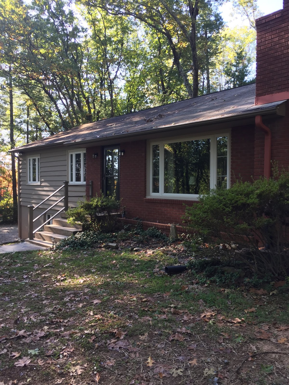
    As you can see below, not only did the existing colors not flatter the house, the different elements of painted siding, brick, vinyl windows, and the raw foundation looked unrelated instead of as a unified whole. The front of the house also looked lop-sided because the right side was one story while the left side was two stories. The existing paint was in very bad condition and nearly everything required significant prep. While Roger began to tackle all of that, I met with the homeowners to discuss the new colors.

    Here's how the house looked on the day of the estimate:

    Front Side Before

    Front Door and Storm Door Before
    Red, White and Blue

    Right Front Window Before
    Note the Small Scale Trim


    Downspout and Chimney Flashing Before
    Distracting

    Garage Side Before
    The Lower Half Looks Unfinished


    Patio Area Before
    Vinyl and Paint Colors Don't Work
    Patio Door Before

    Back of the House Before
    Unpainted Lattice

    Color Considerations


    The first thing I explained to the homeowners was that the colors of the fixed elements, including the yellow-red brick and the brown roof, had to guide us, as it was crucial that the new colors coordinate with them. There also was the new flagstone patio by the kitchen door to be considered and the stark white vinyl windows and storm doors. Then there were utilitarian items like the downspouts and other details that were in full view. My goal was to camouflage them when possible, or at least diminish their impact.

    After we walked around and talked, we started looking at large color samples on every side of the house with their different lighting conditions. Eventually, the winning siding color was Benjamin Moore Alexandria Beige HC-77. We used premium quality Aura Exterior Paint throughout.


    How Color Selection and Strategic Placement Addressed The Issues 


    • To make the house look unified and less lop-sided, I suggested that the new siding color be similar in value to the brick, and that the foundation be painted in the body color. Because the lot is shaded, a darker color would have looked gloomy, but Alexandria Beige worked well with the brick, roof, and patio.
    • The white downspout and the chimney flashing on the front side needed to disappear, so we matched the brick and painted them in Georgian Brick HC-50.
    • To add interest, the fascia was painted in Fairview Taupe HC-85.
    • The trim around the vinyl windows was very skimpy and plain. To make the trim look larger and reduce the contrast between the siding color and the vinyl, we used a lighter color than the siding, Stone Heath #984, and Roger painted not only the existing trim, but the fixed metal edge of the window. 
    • The front door and the storm door were painted in Aura matched to Sherwin Williams Sealskin SW7675.
    • The patio door and storm door were painted in Alexandria Beige.

    The Results: 


    Front side looking left
    Front Door After


    Front Window After

    Downspout and Roof Flashing After

    Garage Side Almost Finished


    Back After
    Patio Area After

    Patio Door After

    Our clients were thrilled by the way the house looked when we were done, and we were almost as happy as they were. 

    If your house needs a makeover, call Sandy at (828) 692-4355 to schedule an estimate. We can achieve the same kind of results for you!

    Monday, April 22, 2019

    How to Find a True Paint Color Expert

    There are a lot of self-proclaimed paint color experts these days, many of whom have little or no scientifically based color training. Some have even created their own approach and managed to market (and monetize) it with workshops, videos, color sample boards, blog posts and more. What most have in common is that the best they can offer you is their personal opinions about color, but unfortunately opinions aren't the same as true color knowledge.

    So What's Wrong with Opinions? 


    What's wrong with having only opinions to offer is that color is a personal experience because of our unique vision and brain. So when one of these "experts" on Pinterest or Houzz or in a blog gives an opinion about a color, all they're telling you is what the color looked like To Them in some unknown setting, with no objective data to support their claims. Since color is light waves that are defined by context and by the observer, their opinion doesn't help you. You have no idea whether or not they have good color acuity, or under what circumstances they formed their opinion. This reliance on unsubstantiated opinion in the absence of any scientific standard also explains the confusing and often conflicting claims you see about a color's "undertones".

    I can tell right away that someone doesn't know color when I see the use of the term "undertone". There is no such thing because architectural paint is opaque. Straight out of the can it doesn't have undertones. Instead, every color except pure black, pure gray and pure white belongs to a hue family. True color experts know this and know how to scientifically identify these hue families and use Hue along with other objective information, including Value, Chroma and Light Reflectance Value to specify color.

    Sandy LeRoy, Camp Chroma
    Certified Color Strategist II 

    Bottom Line


    When you want to work with someone who really knows their stuff, ask if they use objective, i.e. scientific and measurable color data values in their work. Better still, ask if they're a Certified Color Strategist through Lori Sawaya's excellent training in Camp Chroma at The Land of Color. They're truly knowledgeable people you can count on, and I'm proud to be one of them.


    Friday, June 23, 2017

    Asymmetrical Angled Ceilings: A Simple Solution Using Color

    Color contrast highlights an awkward slanted ceiling.
    Many homes have asymmetrical angled ceilings, some by design and some as a result of the practical need to accommodate functional items like closets, framing or duct work. Sometimes the entire room is like this and sometimes it's just one or two walls, but either way the result can be awkward and discordant. When it comes to painting these rooms, where you put color will either call attention to the problem or help to minimize it.

    Look at this bedroom ceiling. All of it is angled, but in several places there are additional sloped sections to accommodate a closet or lead to an adjoining room. Because of high contrast, the white ceiling and dark brown walls not only made the room look uncomfortably unbalanced, it undermined the beauty of the wood beam in the center of the peak because the pure white didn't flatter the wood.

    This room is another example of a common automatic pilot color decision - painting the ceiling plain white. That's what you're supposed to do, isn't it? (No.) Adding to the problem, the baseboards, doors and windows were white with very bad brown glazing that looked splotchy and dirty. The small adjoining bathroom had the same issues with odd angles and bad glazing that didn't work with the stone counter top and tub surround. 

    It was time for a new approach to help this master suite live up to its potential. 


    After: awkward angles are less noticeable.

    Fortunately there's a very simple solution for bringing unity and harmony to rooms with angled ceilings: paint the ceiling and walls the same color. When you do this your eye sees the room as a harmonious whole instead of components, and it enlarges the space while minimizing the impact of all those angles. 


    After: one color on ceiling, walls and baseboards.
    In the "after" pictures you'll see that we chose a serene blue-green for the ceiling, walls and baseboards. It made the room feel more open and spacious, made the angles in the ceiling less noticeable and made the beam a more attractive feature. The doors and windows were painted in the same warm off-white that was used in the rest of the house.

    This project is a perfect illustration of smart color selection combined with strategic color placement to solve a design problem and create a beautiful, coordinated master suite. 

    If your house has design challenges (interior or exterior), we can show you ways to use paint colors strategically to help resolve them. Call me for a painting estimate at 828-692-4355. If we do the painting, my help choosing colors is a free service.


    Monday, June 5, 2017

    Camouflage or Feature? Strategies for Exterior Painting

    No matter what you're doing, how you treat the details really matters and getting them wrong will trip you up every time. When you're painting the exterior of your house, you need to anaylze seemingly unimportant or small things and have a plan for how you'll deal with them. If you don't, they'll become distractions at best or eyesores at worst, and ruin the overall look. 

    Since exterior painting is an investment, it makes sense to not lose these no-cost opportunities to enhance the best features of your house and camouflage the ones that are functional or unattractive.

    Exterior Details to Hide, When Possible


    To camouflage something, paint it the color of the surface it's on, usually the wall. In the case of downspouts, sometimes they cross the roof or fascia as in this picture, and in that case, the part along the fascia should be painted that color. Note the cabinet where the meters live has been painted the wall color. 

    Here are some more candidates for the camouflage treatment:
    • Most construction banding boards (They're usually there as joinery, not as decoration!).
    • Garage doors, if they can be painted. Read your door warranty first as painting some doors could void the warranty.
    • Utility boxes, wires and pipes.
    • Air conditioning unit surround.
    • Gutter exteriors, if they can be painted, and especially when the colors don't work with the roof or the paint colors.
    • Deck undercarriages and support posts, in some situations.
    • Lattice under a porch or deck. 
    • Roof jacks and vents.
    • Foundation.
    • Small vents in gables.
    • Small scale trim pieces used to create outlines.
    • Miscellanous doors and windows in awkward locations. 
    • Unpaintable items like white vinyl windows and doors. They can ruin the look of your house if
      Coordinated vinyl and window trim colors.
      there is high contrast between the trim and wall colors and the windows. Camouflage them by painting the trim the same color so that the windows look like a single unit as you can see in this picture, and by choosing a low contrast color for the walls. 

    Before you start your painting project, take the time to study your house and make a plan.

    Exterior Details to Feature

    • The front door. Paint it a special color coordinated with the wall and trim colors, and with the flowering plants in your landscape. Don't use that color anywhere else.
    • Decorative details.
    As you see, this list of things to showcase is much shorter than the list of things to hide. That's because simplicity is usually best because it supports the architectural integrity of your house.

    When it's time to paint your house again, pay attention to these details. You'll be amazed at what a difference it will make to have a smart strategy for them.

    Wednesday, November 23, 2016

    Don't Default to White

    One of the most common and jarring color mistakes I see is the use of plain white paint on ceilings and on interior and exterior trim, apparently without determining whether or not it's a good choice. I'm guessing that these things get painted white by default in the mistaken belief that it's "safe" because it's usually what people do, and finding a wall color they liked was stressful enough. After all, plain white goes with everything, doesn't it? Or does it?

    White Ceiling and Trim By Default
    Don't get me wrong. I like white, even plain white, when it's used in the right way, with the right wall colors and in the right places. But unfortunately I usually see it used with high contrast and/or neutralized wall colors and with natural materials like granite, wood, stone and tile. It's a combination that's unflattering to all participants because when there's no common color present to tie everything together, what your eyes see is the way they're different, and that sets up the perception that something isn't quite right.

    Keeping It Simple: Basic Things to Consider When Choosing a White

    Hue Family of the Wall Color


    Every color, unless it's pure white, pure black, or white with varying amounts of black added, can be traced to a hue parent (red, orange, yellow, green, blue, purple). The hue family of your wall color is where you should start to find the right white for the ceiling and/or trim.

    Tint, Tone or Shade?


    After you identify the hue parent, decide if the color is a tint (hue plus white), a tone (hue plus gray), or a shade (hue plus black).

    Think of tints as pastels and tones and shades as neutralized colors. If your wall color is a tint, avoid the neutralized whites. If your wall color is a tone or a shade, avoid the tint whites. Fortunately, clear, bright tint colors are easy to spot when you're standing in front of the displays at the paint store, helping you to stay in the right area when you're looking for a white that will work.

    For example, if you use a neutralized member of the yellow family (a tone or shade) on the walls, look for a neutralized white from the yellow family for the trim. If you have a tint yellow on the walls, use a white tinted with yellow for the trim. If your wall color is a neutral such as a taupe that looks like a green/brown combination, your off-white trim should have at least one of these components.

    This isn't the only approach to choosing a white,  just a way to keep it simple.


    How Much Contrast?


    Deciding how much contrast you want between the ceiling, walls and trim should be based in part on how much attention you want to focus on them. With higher contrast colors you need to be sure that that the trim has merit and is attractive and well-proportioned.

    A Collection of Boxes
    For exteriors this is especially important because treating functional banding boards as trim and painting them in a high contrast color like plain white is very unflattering and undermines the crucial sense of unity and harmony. After all, you don't want your house to look like a collection of boxes... For interior trim, unless it's unusually large and lovely, consider painting the crown and baseboards in the wall color or in a low contrast accent color from the same family to make the room look larger. 


    LRV (Light Reflectance Value)


    If you've decided to have white trim, you can choose a white with exactly the right amount of contrast by looking up the Light Reflectance Value (LRV) for your wall color and then for the whites you're considering. 

    Paint manufacturers determine the LRV for each color they make by measuring it with a device and numbering the result on a scale of 0 to 100, with 0 being the blackest black and 100 being the most reflective white. An LRV of 50 is the happy medium and the standard for residential interior wall colors. To see contrast between two colors you usually need a difference of at least 7 points. In addition to finding LRV numbers on line at each manufacturer's web site, you can find the values for Sherwin Williams colors on the back of the paint strip and the values for Benjamin Moore colors at the back of the fan deck in numerical and alphabetical order. Comparing LRV values eliminates the need to guess about contrast and is easy to do.

    To Sum It Up:


    Use plain white for your ceilings and trim only if you love it and after you've done the homework to be sure it works with your wall color. While you're at it, consider branching out by using a color other than plain white. There's a universe of beautiful colors to choose from, and one or more of them is probably a much better choice.


    Thursday, April 7, 2016

    How to Choose a Paint Color for Exterior Stairs

    Before - Stair Risers Accented in the Trim Color
    It's fairly common to see front stairs and risers painted different colors, but it doesn't necessarily mean it's the best approach. I believe that the only details that should be painted an accent color are the ones that deserve the attention, and stair risers usually don't qualify for the spotlight. 

    In the "Before" picture the stair risers were painted in the trim color and the deck and stair treads were painted a green that clashed with the yellow walls and the cement walkway. Between the excessive accenting and the color clashes, far too much was going on. 

    The house was about to go on the market and it was essential that the picture of the exterior for the MLS listing have maximum appeal. In a perfect world I would have recommended a color change for the walls, front door and storm door, but that wasn't in the budget. 


    After - Treads, Risers and Deck Painted One Color
    The deck and stairs were in poor condition and had to be painted. That created the opportunity to make the house a little bit more photogenic by correcting the color disharmony and reducing the number of accented details.  

    I recommended using a single color on the deck, treads and risers, one that was chosen to coordinate with the house and cement walkway.  In the "After"  picture you see the benefits of treating the stairs and deck as a single unit. 


    Some Color Considerations for Exterior Stairs


    Here are some color considerations for exterior stairs, particularly front stairs:
    • What are the colors in the permanent details of the house and landscaping, such as in roof, walkways, stone foundation, key flowering plants, etc.? You have to consider all these colors when choosing the stair color.
    • What paint colors are used on the house and trim (wall color, front door color, trim color(s), etc.)? Do they work well with the permanent details? The stair color should coordinate with everything. You might be able to use the stair color to create more color harmony between the house colors and the colors of the permanent details, if needed. 
    • Consider the architecture of the house. Are there already lots of accents, or does the house need more? If more pizzazz is needed, are accented stairs the best way to provide it?
    I think restraint is usually the best approach to accenting, so my preference in most cases is to use a single color for stair treads and risers. As the "Before" and "After" pictures demonstrate, using one color creates better flow because your eye takes in the stairs as a single unit, as opposed to seeing the stair components. 

    What you might have thought to be a simple matter, painting the stairs, is in fact something that has a big effect and deserves thought.

    When it comes to color selection, whether it's for stairs, the whole exterior, or for the inside of your house, success comes down to choosing the right colors and using them in the right places. Color selection is the phase that receives the most emphasis, but I believe that where you put the colors is equally important. Color placement done correctly is a powerful tool that can correct many design shortcomings, showcase the best, hide the rest and help your house live up to its potential.

    If you have a painting project coming up and would like help with choosing and placing colors, call me at 828-692-4355 to schedule a color and design consultation. If we do the painting for you, this help is a free part of our services. 


    Thursday, December 3, 2015

    Incremental Color Decisions

    We're doing an interior painting project at the moment, and I've been working with the
    Solving the Paint Color Jigsaw Puzzle
    homeowners to create a coordinated color palette. I think of this process as putting together a color jigsaw puzzle, using placement of each piece to help guide where the next one should go. 


    I prefer to work this way whenever I can because I believe the best results come from making incremental decisions as the job progresses, using each color successfully applied to help guide the next choice, rather than trying to choose all the colors at the beginning from samples. 


    At our current project, the owners have removed wallpaper in the kitchen, powder room, guest bedroom, master bedroom and bathroom. More rooms will be painted as they get around to removing more wallpaper. 

    Our first decision was the kitchen wall color because of its importance as their main living area, and because I always begin by analyzing the colors of the fixed elements in the house, such as flooring, tile, counter tops and cabinets. Every color we use has to work with things that are unlikely to change, at least for a while.  The next decisions for logistical convenience were the powder room wall and vanity colors, followed by the guest bedroom walls. The master suite wall color is being chosen last because it's at the far end of the house, allowing more color latitude if desired, and because the carpet is being replaced. The new carpet contains several shades of off white, and the overall color impression was difficult to project, so I wanted to choose the wall color after the carpet was installed to be sure it would work with it and with the bathroom tile.

    Some Benefits of Incremental Decisions


    Color Behavior 

    Choosing colors incrementally provides an opportunity for me to see how each color behaves on the walls before choosing the trim color. Many people have learned from experience that the way a paint color looks in a sample can be dramatically different when it's applied to four walls. By making color decisions one room at a time, you can be sure each color is right for that room, that it will harmonize with the overall color plan, and that the trim color will be right for all the rooms.

    More Informed Recommendations

    Incremental color decisions help me make more informed recommendations as I can easily see how the puzzle is coming together, and it also gives me a chance to suggest color strategies for extra pizazz or to solve any design issues that might arise. 


    Maximum Flexibility

    Incremental decisions give us maximum flexibility as the clients and I discuss what colors they like best, or don't like as much as they expected to, and make changes as needed. Maybe a color looks darker than they thought now that they see it on the wall instead of in the sample. Fine. If they can live with it, we'll use what they've learned for future choices. If they can't live with it, how much easier to redo one wall or one room than the entire house! 


    Reduced Anxiety

    Last, but by no means least, making one decision at a time is a lot less stressful for our clients. They have a much better idea of how everything will look as it comes together, greatly reducing their color decision anxiety. They grow more and more excited, confident and happy as their vision comes to life.


    Of course making incremental decisions means that I'm on site every step of the way, and even though my help is a free service to our painting clients and it's time-consuming, Roger and I think it's the best approach. We know that if the colors aren't just right, our clients aren't going to be as happy as they could be, no matter how good a job he does. My involvement helping them find colors they love to live with, along with Roger's superb craftsmanship, really sets us apart. We like that too.


    If you have a painting project, call me at 828-692-4355 to schedule an estimate. Once you choose us to do the work, I'll come to discuss your ideas and we'll find your perfect colors. 

    Thursday, April 2, 2015

    Cranky About the Color of the Year

    Pantone Color of the Year 2015-Marsala
    In recent years it's become the practice for paint companies such as Sherwin Williams and Benjamin Moore, and other companies such as Pantone, best known for its color matching system, to name a color of the year. The choices are often quite different, making it difficult to see how any of them represent an informed idea, or anything beyond a way to generate sales.

    Color(s) of the Year 2015 


    Take this year, for instance. Pantone says the Color of the Year is Marsala. Sherwin Williams says it's Coral Reef, and Benjamin Moore says it's Guilford Green. 


    Sherwin Williams Color of the Year 2015-Coral Reef

    If you want to be trendy, which of them should you choose? Can they all be right? What if you don't like any of them? And what are you supposed to do next year - paint the house again?

    Here's Where I Get Cranky


    It may not bother you, but I don't like the idea of people sitting in a room somewhere deciding what colors I should live with. The notion that they can make this choice for you and me and everybody else, with zero consideration for whether or not the color is appropriate, is laughable. We aren't cookie cutter people! One color of the year (or three, or more) doesn't fit all.

    Benjamin Moore Color of the Year 2015-Guilford Green

    What About Fashion Trends?


    To me, these color pronouncements are very different from fashion trends because they often involve significant expense and are decisions we usually live with for a long time. Fashion trends are fun, can be indulged cheaply and left behind without remorse, unlike a Marsala living room.

    What You Need to Consider When Choosing Paint Colors for Your Home


    When it comes to the use of color in your home, I think you should forget about the so-called Color of the Year and instead focus on:
    • the location of the house (mountains, seashore, etc.)
    •  the style of architecture
    • the color of permanent details such as flooring, carpet, counter tops, cabinets, stonework, etc.
    • the colors in major pieces of furniture
    • the exposure of the room (North facing, South facing)
    • the color temperature(s) of the light bulbs.
    • the way the room will be used
    • the colors you like
    These considerations are timeless and won't steer you wrong.

    Other Pronouncements


    Many people have been embracing the use of gray for interiors, even though certain designers and paint companies tell us that gray is OVER. I say that if you like gray and it works well in the context of your home, you should use gray and be happy.

    Then there are the designers who tell us that we all should have white kitchens. I love white kitchens as much as the next person, but I also love other ideas when they work. The right kitchen design is situational, not a formula. 

    So you see, I really am cranky about this whole Color of the Year business, and about design and color pronouncements from people who generalize. I pay little or no attention, and I don't think you should be concerned with them either, except for fun.

    Tuesday, August 6, 2013

    Negative Space - A Powerful and Versatile Tool

    Negative Space Example
    from marthastewart.com
    Contrary to what the word "negative" suggests, negative space can be a very good thing. When it's used properly, negative space is a powerful and versatile design tool that can have a positive impact on everything from real estate marketing to our overall quality of life. 

    Think of negative space as unoccupied territory, a place where the eye can rest between points of interest, allowing or creating a clear view of each. Another way to think of negative space is breathing room, or a pause in a conversation that gives you a chance to relax and collect your thoughts. 

    The empty frames in this image allow you to see their shapes and colors, and because they're empty, they complement, rather than compete with the elaborate design of the settee. Your eye can take in the composition in as a whole, and then slowly appreciate the individual elements. 


    How Negative Space Gets Lost


    Negative space is often lost because of anxiety or guilt. Empty spaces make some people feel uneasy, so they put something, anything, in corners or on walls. Often, the pieces are too small, or serve no logical purpose in that spot, or are otherwise homeless, so they're put to work as space fillers. Then there's the gift that you feel you have to display, whether or not it works in your house. Negative space is also lost to "piling up." In the course of daily life, stuff has a tendency to pile up because it's put in a spot "temporarily", and then forgotten. Whether the cause is intentional filling up or accidental piling up, the result is visual clutter, the enemy of tranquility and organization, not to mention good design. Having too much stuff around is also stressful, and it can be detrimental to your health because it makes cleaning more difficult, providing collection points for dust and dirt and mold. 


    Negative Space When You're Selling


    When you're getting your house ready to go on the market, it's important to make it look as large as possible. One way to do that is to remove small pieces of furniture, superfluous accessories and the stuff of daily living, then be sure the remaining items are attractive and colorful, and that they're arranged with sufficient negative space around them to create the impression of spaciousness. This editing also enables you to produce marketing pictures that showcase the focal point of the room, such as a fireplace. After all, it's the architecture you're selling, not your stuff. Another benefit of editing is that it forces you to start packing and begin the process of letting go, so that your house can become a marketable product, instead of a home. 


    Editing To Create Negative Space


    When I do a staging or redesign consultation, editing is a crucial part of my work. We're so used to seeing certain objects in certain places in our homes, it can be difficult to imagine how things could be different. Assumptions need to be tossed out the window to make a fresh start, so I like to remove all the decorative accessories from the walls and horizontal surfaces. This step may seem extreme, and sometimes the homeowner is stunned at first, but it's very effective because it helps me to really see the bones of the room and adjust the furniture layout, as needed, before selectively adding back key accessories. This step also makes very clear how well the paint colors are (or aren't) working with the flooring, counter tops, stone, tile, etc., and with the furniture. 


    Make Room For Negative Space


    Look around your house. Do you see any accidental or intentional accumulations of stuff? If you'd like to start fresh, call me at 828-692-4355 to schedule a redesign consultation. If you're selling and need help to prepare your house for effective marketing pictures, schedule a staging consultation. 

    Remember the positive effects of negative space!


    By:  Sandy LeRoy