Showing posts with label Sterling Property Services. Show all posts

Monday, February 10, 2020

Interior Painting Tip: Paint Color Chips and Strips Can Deceive You

Have you ever looked at a small paint chip or color strip to choose a color for an interior painting project? Tough, isn't it! And if you made your color decision from one of these small samples, it's no surprise that the color you wound up with didn't turn out to be the color you wanted, or the color you thought you'd chosen. 

Nobody, including those of us who work with color all the time, can make an informed color decision from a tiny sample. 


Chips and Strips Are Deceiving


Here are some reasons why samples from chips or strips are deceiving: 


Color's Cumulative Effect  


Studying a paint chip, even one of the somewhat larger ones some manufacturers now provide, won't give you an accurate idea of how the color will look on a large surface. Think of the effect of red paint on a wall vs. red trim on an accent cushion. 

Once applied to a wall, dark colors will look darker and bright colors will look even brighter. Not only that, the impression a color makes on one wall will intensify once it's applied to all the walls. 
    Two Types of Color Strips

    Color Strips: Competition and Distortion  


    When the color you're considering is on a strip in a fan deck, you get an even more distorted impression because:
    •  Each sample is so small.
    •  Adjacent colors affect each other.
    • The white strip between each color makes you think that the color isn’t as bright or intense as it really is.


    No Standardization


    There are three types of color strips:
    • a progression of one color from light to dark. 
    • different colors from one hue family.
    • unrelated colors. 
    Pay attention to the organization of the strip you’re looking at. While paint strips can help you make an initial decision and are useful for basic comparisons, these small samples make it impossible to figure out what each color really looks like. However, I do find that when I'm trying to work with a particular hue, the strips with a progression of colors are helpful. 

    Other Issues


    Orientation 


    Paint color changes with the orientation in which it's applied. As a result, your wall color will look different if you apply it to the ceiling. Choosing a ceiling color can be especially challenging because you can't put a tiny chip or paint strip on the ceiling and tell how it will look. Ceiling color will also be affected by the colors of the walls, flooring, and furniture, among other factors, but you won't be able to see the effect of this phenomenon working from a small sample. 


    Lighting

    The lighting at the paint store likely is quite different from the lighting in the space you're planning to paint, and that means the color will look different there. The color will also be affected by many other factors, including the time of day and whether you're viewing it in natural or artificial light. Small samples can't show the true effect of lighting.  

    The Solution: Larger Color Samples 


    Larger samples are the best way to make a more educated guess about the impression a color will make - before you invest in the paint. 

    Some people paint samples directly on the wall side by side and try to compare them. This approach doesn't work well because the existing wall color and the neighboring samples will distort what you see. 

    A better approach is to create your own oversize samples, using inexpensive, lightweight foam core sample boards. Buy some that are at least 2 x 3 feet in size, and apply at least two coats of paint. Your local paint store will sell you sample pots of the colors you're considering, with just the right amount of paint. Always cover 100% of the board so that there are no white borders to distort your perception of the color, and use a different board for each color. 

    Advantages of larger samples

    • The true color impression is more apparent than on a chip.
    • You avoid the color competition and distortion caused by looking at a color on a strip or on the wall next to others you're considering.
    • You can move the sample around the room and even affix it to the ceiling with removable tape to view it in different orientations.
    • You can move the sample to view it adjacent to large pieces of furniture, window treatments, and accessories.
    • You can easily evaluate how the color works with colors used in adjacent spaces.
    • Sample boards avoid the need to prime or use additional coats of paint to cover test areas on the wall. 
    When you're choosing paint colors, large individual samples are best. Study the samples on every wall at different times during the day and at night under natural and artificial lighting.

    If You Need Help


    As a #Certified Color Strategist, I use my advanced training and the latest in digital color technology to inform and streamline the process of helping you choose paint colors that work. If you'd like to talk about your project and schedule an appointment, call me at 828-692-4355. If you live outside my service area, you can also arrange an online consultation. 


    Tuesday, January 21, 2020

    Going to the Paint Store? Read This First.

    Making unnecessary extra trips to the paint store can be frustrating, not to mention time-consuming and expensive. Next time you have a project, make sure you're ready to get the best advice and color inspiration by doing a little homework first. 


    What's the Purpose of Your Visit?


    Have a clear idea of what you want to accomplish so that you ask the right questions and bring all the pertinent materials and information with you. 

    Outline the Basics of Your Project 


    Use this list to describe your project to the counter person so they can focus on the key issues.

    • Interior or exterior.
    • New construction, remodel, repaint or repair project.
    • Is the existing paint or stain oil base or latex? 
      • Bring or photograph the old paint or stain cans, if you have them. The label will also enable you to identify the existing color, including the formula if it was a custom mix.
      • If you're not sure if the existing paint is oil or latex, wet a rag with denatured alcohol. Rub a small circle with the cloth for about twenty seconds. If you remove a fair amount of paint, it's likely a latex product. If it's oil, the alcohol will just clean the surface.
    • What surfaces are being painted? Ceiling, walls, cabinets, trim.
    • What is the condition of the surfaces?  Good, flaking, peeling, chalking, moldy, smoke stains, water damage stains, previously wallpapered, pre-primed, etc. Condition will help determine what preparation is needed.
    • Your budget. Do you want to use the very best products, very good products, or good enough products? Manufacturers offer a range of products for all budgets.
    • Other considerations or questions, including referrals to paint and color professionals, if you're not doing the work yourself.


    Color Selection/Matching Tips


    • Planing a color change? If yes, will it be minor or significant? Do you need help finding the right colors? Discuss the number of coats needed for coverage, and if priming is recommended.
    • Do you have tinted windows that filter natural light? You'll need to factor in the effect when choosing interior colors. 
    • What type of light bulbs are you using? (LED, halogen, incandescent, etc.) 
      • the color temperature of today's bulbs varies greatly from warm to cool and will affect paint colors. 
      • The paint colors you like in the store will appear very different on the walls in your home, depending on your light bulbs. 
      • Some stores have a lightbox to show you how a color will look under different lighting conditions. Ask at the counter and be sure to study your samples in both natural and artificial light.
    • Use your phone to bring pictures of your project.
    • Bring samples of key elements such as flooring, countertop, fabrics, etc. to give you a starting point for choosing colors and save you money by reducing the number of paint samples you buy. 
    • Matching an existing stain: Bring a sample of the item to be matched, along with a generous piece of the actual wood that will be used.
    • Matching existing paint: 
      • When you have the can of original paint, bring it with you. 
      • When you don't have the paint can, remove a light switch and with a razor blade cut a facepiece of the painted drywall behind it, which will be the original color. The larger the piece, the more accurate the match. 
      • The really good paint stores keep records of their customers and the paint colors they used. 

    Success Is Up To You


    If you gather the right information before you leave the house, you'll get better guidance at the paint store, you'll make fewer frustrating trips, and you'll save time and money while getting better results. 


    Wednesday, January 1, 2020

    Choosing Paint Colors On Line: Be Aware of the Pitfalls

    Many people are surprised and upset when they choose a paint color after seeing it online, only to find that it doesn't look the way they expected when they paint their house with it. What happened? Why does it look different? Here are some of the major reasons:

    Digital Color vs. Color in the Real World


    The many thousands of colors we can see exist in a three-dimensional color space known as the Human Gamut of Color, as charted in the diagram on the right. 

    However, the capabilities of the digital color display on your phone, computer or television are limited to colors that can be created by red, green and blue light, a much smaller color space known as RGB. The result is that these devices can't show many colors accurately, especially in the green, blue and purple hue families. 

    The colors used in printing come from cyan, yellow and magenta ink (plus a key color), an even smaller color space known as CMYK. 

    When you understand this, the reason for difference between the color you loved on line and hated on your wall, or the color you chose online for your printing project that didn't meet expectations, is much more understandable. 


    The Human Factor

    As if the color space problem wasn't challenging enough, there are other issues. Color isn't a fixed property of a surface, it's a sensation and a unique personal experience. I say experience because color is created by light waves from the visible spectrum that come in through our eyes and get processed by our brain, and because we're unique beings, each of us sees color differently.

    Light 

    Because the sensation of color is created by light waves, it changes with the light in each space. Just think of how different a color looks in daylight vs. artificial light, or in the morning vs. the late afternoon. Color is a moving target. 

    So How DO You Choose Paint Colors?

    We all love going online for paint color inspiration. Just be aware of the limitations of the colors you see in a digital space and think of them as approximations only. Remember that color is totally defined by its context, and the same color can be expected to look different as its environment changes. 

    As an architectural paint color consultant, I know there’s a better way to choose paint colors successfully. It starts with identifying the color properties of the fixed elements in your home, inside or outside, and using them as your starting point for finding paint colors. The reason is that if you ignore them and use the color you think is the answer after seeing it online, it likely could be an expensive mistake. Liking a color should be one of many considerations, not the only one. 


    I Can Help

    With my advanced training as a #Camp Chroma #Certified Color Strategist II, and using the latest in color technology, I can identify the essential color properties of everything from granite to roof tiles. I then use that color DNA as well as the color DNA of every single paint color you’d like to consider, to know instantly if they’ll be harmonious in your room or on the outside of your house. I also give you large samples of these colors to look at in your space. No guesses about a color’s “undertones”. There’s no such thing in architectural paint out of the can, by the way. And no expensive, time-consuming and frustrating trips to the paint store. 

    The other thing I can do, which most color consultants don’t offer, is to guide you in strategic color placement. I believe that finding the right colors is just half the equation. You also need to know where to put the colors so that you feature the best and minimize the impact of bad design, functional details, or other issues like a large open space, asymmetrical ceilings, low ceilings or skimpy trim. 

    If you need expert help, call me at 828-692-4355 and tell me what problems you're having. I'll work with you to find pleasing solutions to your most challenging color dilemmas. 


    Tuesday, October 1, 2019

    Prevent Ladder Damage to Your House

    Roger sees ladder damage all the time: black scrape marks on siding caused by leaning or dragging a ladder, dirt or other contaminants transferred to the siding by a ladder, or even worse, chipped paint on gutters, or even dented gutters. The culprit might be window washers, gutter installers or cleaners, amateur painters or pressure-washers, or it might even be you.


    Repairing the Damage


    Pressure-washing doesn’t help, nor does a cleaner like Jomax. Sometimes a magic eraser can reduce the scrape marks, but usually repainting is needed. And if metal gutters are damaged, they may have to be sanded and spot primed before repainting. Don't ignore seemingly minor damage to metal gutters because chipped paint eventually will cause rust. 


    Prevention is the best medicine


    If you’re having work done, be sure to have a conversation when you're getting the estimate about the need to make sure all ladders are clean and wrapped and equipped with a stabilizer when appropriate. Be sure to be there during the work so you can double-check to be certain the ladders are properly prepared. If you're doing the work yourself, get a pair of ladder booties and keep them clean.

    Friday, August 9, 2019

    Every Detail Mattered: An Exterior Transformation in Tryon

    This was a project Roger and I were eager to do. From the moment Roger first saw the house when he did the estimate, to my first look at the pictures he took that day, we both knew that our craftsmanship, color expertise, and attention to detail, along with using top quality materials, could make a significant difference. Not only could we add to the value of the home, we could also give our clients a place they could enjoy and be proud of.

    Front of the House After

    First Impressions

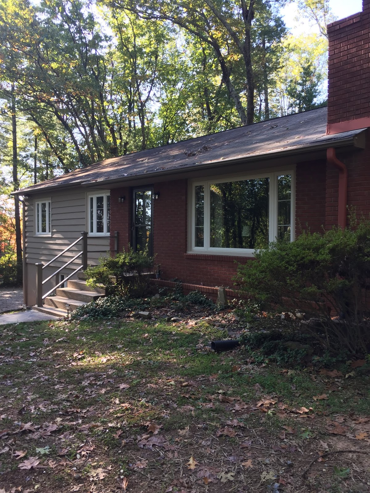
    As you can see below, not only did the existing colors not flatter the house, the different elements of painted siding, brick, vinyl windows, and the raw foundation looked unrelated instead of as a unified whole. The front of the house also looked lop-sided because the right side was one story while the left side was two stories. The existing paint was in very bad condition and nearly everything required significant prep. While Roger began to tackle all of that, I met with the homeowners to discuss the new colors.

    Here's how the house looked on the day of the estimate:

    Front Side Before

    Front Door and Storm Door Before
    Red, White and Blue

    Right Front Window Before
    Note the Small Scale Trim


    Downspout and Chimney Flashing Before
    Distracting

    Garage Side Before
    The Lower Half Looks Unfinished


    Patio Area Before
    Vinyl and Paint Colors Don't Work
    Patio Door Before

    Back of the House Before
    Unpainted Lattice

    Color Considerations


    The first thing I explained to the homeowners was that the colors of the fixed elements, including the yellow-red brick and the brown roof, had to guide us, as it was crucial that the new colors coordinate with them. There also was the new flagstone patio by the kitchen door to be considered and the stark white vinyl windows and storm doors. Then there were utilitarian items like the downspouts and other details that were in full view. My goal was to camouflage them when possible, or at least diminish their impact.

    After we walked around and talked, we started looking at large color samples on every side of the house with their different lighting conditions. Eventually, the winning siding color was Benjamin Moore Alexandria Beige HC-77. We used premium quality Aura Exterior Paint throughout.


    How Color Selection and Strategic Placement Addressed The Issues 


    • To make the house look unified and less lop-sided, I suggested that the new siding color be similar in value to the brick, and that the foundation be painted in the body color. Because the lot is shaded, a darker color would have looked gloomy, but Alexandria Beige worked well with the brick, roof, and patio.
    • The white downspout and the chimney flashing on the front side needed to disappear, so we matched the brick and painted them in Georgian Brick HC-50.
    • To add interest, the fascia was painted in Fairview Taupe HC-85.
    • The trim around the vinyl windows was very skimpy and plain. To make the trim look larger and reduce the contrast between the siding color and the vinyl, we used a lighter color than the siding, Stone Heath #984, and Roger painted not only the existing trim, but the fixed metal edge of the window. 
    • The front door and the storm door were painted in Aura matched to Sherwin Williams Sealskin SW7675.
    • The patio door and storm door were painted in Alexandria Beige.

    The Results: 


    Front side looking left
    Front Door After


    Front Window After

    Downspout and Roof Flashing After

    Garage Side Almost Finished


    Back After
    Patio Area After

    Patio Door After

    Our clients were thrilled by the way the house looked when we were done, and we were almost as happy as they were. 

    If your house needs a makeover, call Sandy at (828) 692-4355 to schedule an estimate. We can achieve the same kind of results for you!

    Thursday, March 28, 2019

    Our Laundry Room Make-over

    The "new" laundry room 
    There was no question that our little laundry room was looking tired. It had worked hard ever since we moved here nearly fifteen years ago, serving as laundry central, cat central and as the place for flower arranging, etc. The original Formica counter top had gotten nasty and the white laminate shaker style cabinets didn't really suit the rest of the house which has cherry wood kitchen cabinets and cherry stained doors and trim throughout. The laundry cabinets were good quality and in great condition, but their color and style were just wrong. We weren't about to change them, but it was long past time for a makeover to make them feel less out of place.

    I admit that sometimes I wish Roger could drop everything and work on our latest project because having the house torn up for long periods of time is no fun, but that's not the way it goes with us. Painting for our clients always takes precedence! And even though the laundry room is a small space, there was a lot of time-consuming work involved, so the transformation wasn't going to be a quick fix.


    Roger had to paint the ceiling and walls, the interior of two double storage closets with wire shelving units and three banks of cabinets. There was a lot of packing up and dismantling to be done before he could even start painting. Everything seemed to move at a snail's pace to an impatient sort like me, but Roger knows the right way to do things and that takes time. Because the cabinets were to be done in oil enamel, we also had to allow plenty of drying time once they were painted before the shelves, doors and drawers could be re-installed.

    Here's what the cabinets looked like when we started. The new counter top had just been installed and Roger had taken the first two sets of doors to the workshop.

    Sink side cabinets before
    Washer/dryer side cabinets before


    Getting Started

    The first step was to replace the Formica counter top with quartz, and we were lucky to find a remnant of Cambria "Clyde" which worked well with the limestone floor, the only fixed element in the room that I had to consider. The counter top was the only thing we changed. Everything else was updated with paint.

    As Roger removed the cabinet doors and drawers he labeled where they came from to save time putting them back correctly. He also removed the shelving units in the closets and took down the light fixture, drapery hardware, etc. Once the room was cleared it was time for cosmetic repairs. After covering up, taping and masking off, Roger fixed some bad drywall tape and nail pops in the ceiling and filled the holes in the walls as I didn't necessarily want to put the accessories back in their former places.

    The Painting Phase

    Then it was on to painting. The ceiling and walls went quickly. As you might expect, the cabinets took a lot more work. Each shelf and cabinet door had to be primed because we were putting paint over laminate and then painted two more times on both sides, plus they had to dry properly between coats. After it was all done there was more waiting.

    Here's what we used (all paint by Benjamin Moore):

    Ceiling:  Shaker Beige HC-45 - Ceiling Paint
    Walls and Closet Interiors: Shaker Beige HC-45 - Aura Interior Matte
    Cabinets: Rushing River #1574 - Satin Impervo oil enamel

    Some Details

    I wanted to coordinate the folding table to the left of the dryer, so Roger painted the legs in Rushing River. He also primed and painted the cabinet shelf supports in Rushing River to give the interiors a finished look. We recycled the old chrome and ceramic cabinet knobs and the black light fixture by spraying them in an oil rubbed bronze. Roger painted the metal dryer vent in Shaker Beige to camouflage it. Paying attention to these details really helped.

    The (Almost) Finished Product

    It seemed to take forever, but we're finally back in the laundry room, operating as usual and really enjoying it. The beautiful look of Satin Impervo, a better color, not to mention Roger's expert craftsmanship, transformed those glaring white cabinets. Even though the Shaker style remains, in the new color they now look more as if they belong with the rest of the house.

    Roger isn't quite done yet. He still has to refinish three sets of double doors: one set of entry doors and two sets for the closets. Then it's on to our next project.

    The white plastic shelf supports 
    have disappeared.

    Cabinets after on the sink side.
    Cabinets after on the washer/dryer side.
    Dryer vent painted the wall color.

    If your cabinets look tired and you're ready to give them a new lease on life, call me at 828-692-4355 to schedule an estimate with Roger. I highly recommend him!


    Friday, March 1, 2019

    How to Hire a Pressure-washing Service

    Residential and Commercial Pressure-washing
    by Sterling Property Services
    Many people have learned the hard way about the pitfalls of amateur pressure-washing. If you plan to hire a professional and want the best result, how can you find the right company for the job? Here are some suggestions.

    Step One:  Identify Prospects.


    • Ask friends, family and neighbors for recommendations. 
    • Use Google to search for pressure-washing companies, then look at their reviews on Google Maps and visit their web site, if any. 
    • Check Angie's List, Yelp and Houzz. 

    Step Two: Telephone Interview 


    Describe the work you want done. Describe any access problems or other special issues, such as building height over two stories, a steep slope, or the need to provide the water to do the job, as this will automatically eliminate certain bidders.    

    Ask questions to learn about the business. Here are some possibilities, ranging from basic to technical. Choose the ones that work for you.
    • How long have you been in business? Experience counts.
    • Do you have a web site when I can learn more about your company? Having a web site is a sign of openness, accountability and a business-like approach.
    • What type of equipment do you use? Professional equipment can supply a force of 3-4,000 PSI (pounds per square inch). It will have an engine with 11-15 horsepower and water flow of 3-6 GPM (gallons per minute). These figures are sometimes combined into CU's (cleaning units), which is PSI x GPM. Professional equipment has a rating of at least 12,000 CU's. Listen for a clear, knowledgeable response. 
    • What pressure do you use? The answer should be the lowest pressure that will get the job done without causing damage, no more than 1,000 PSI.
    • What chemicals or cleaners do you use? Are they biodegradable and environmentally safe? Could they harm the siding, pets, plants, etc.?  If the answer is “bleach”, beware. Professionals don’t use bleach alone because it isn’t an effective cleaner and can cause injury or damage. They also will work in sections so the cleaner isn’t on the house too long. Listen for product knowledge and awareness of the potential for damage. 
    • Do you carry liability and workers’ compensation insurance ?  If yes, get the name of their insurance agent and confirm the details if you hire them. If an uninsured worker is injured at your house, you could be liable. Sole proprietors with no employees are not required to carry this coverage.
    • Who will be on the job doing the work? What training and experience do they have? This is important. It’s usually best not to hire trainees or temporary workers like students. 
    •  Will you provide a written estimate with a detailed description of the work?  Not all contractors, even some experienced ones, can provide written estimates, but it’s preferable.
    • Can you provide references?  If you have any concerns, call and verify them. Look for reviews on Google Maps, Houzz, Yelp, etc.
    If the answers to these questions are satisfactory, make an appointment for an estimate.

    Step Three: Get the Estimates


    More questions and things to consider:

    • Is the estimator on time for the appointment? Is he business-like and well groomed? Is his vehicle clean and professional with signs? His approach and how careful he is with his own appearance and vehicle will tell you a lot about how he operates. 
    • Walk through the project and describe the work you want done in detail, with any special instructions, such as access issues, areas that need care like a trellis with a delicate plant or fragile ornaments 
    • How will you protect my plants? Covering them with plastic or a drop for more than a few minutes could damage or kill them. We rinse plants before, during and after washing.
    • Does the basic estimate include the exterior of the gutters, the downspouts and foundation?   
    • Can you include an option for inspecting, cleaning and flushing the interior of the gutters and downspouts by hand? 
    • Can you wash my roof? Many companies, including ours, will not wash certain roofs for safety reasons and because of the potential for causing damage.
    • Does your estimate including washing my windows?  Basic pressure-washing does not include more than rinsing windows.
    • Who will remove and replace large container plants and furniture?  What do you want me to do before you arrive?  If you’ll need help, be sure to say so.
    • Are there any special procedures or cautions for cleaning your type of siding? For example, older cedar shakes can easily be damaged by too much pressure and using the wrong tip.  
    • Discuss everything you’re concerned about and agree on what steps the contractor will take to avoid problems.
    • What are the realistic results to expect from washing my house? (See below.)  

    Step Four: Evaluate the Estimates


    Each estimate should contain:
    • The complete scope of work, including the areas to be washed, the preparation that will be done, the products to be used and the clean-up and replacement of furniture and other items that will be done after washing, if included. 
    • Total cost for labor, equipment and supplies, and when payment is due. 
    • How long the estimate is valid.

    Once you have all the estimates, confirm that each bidder is using an identical scope of work. Then you can evaluate and rank them. Compare prices, but be aware that an unusually low bid likely represents the least professional result. Check references.

    Sterling Property Services
    pressure-washing a house in Flat Rock
    Washing Day

    Now that you’ve found the right person for the job, you can relax. Wrong! There are a few things left for you to do.
    • Arrange to be there when the work is done. 
    • Plan ahead for the best result by removing all small and/or delicate items from the work areas. 
    • Park your car (s) in the garage or down the street. 
    • Make certain all doors and windows are closed. 
    • Bring your animals inside or keep them well out of the way. Even with modern equipment, pressure-washing is noisy, and that can be very distressing to some pets. 

    Monitor the work as it progresses to be certain you're happy with the results, but don’t get in the way! 

    Realistic Expectations

    It’s good to have realistic expectations about the results of pressure-washing and to be aware of some of the things that can occur, even when the work is done properly.
    • Pressure-washing may dislodge loose paint or caulking, but if the paint or caulking is sound, it won’t. 
    • Sometimes spots might remain on the siding after it’s washed. They could be bug droppings that have baked into the surface, a common fungus known as artillery or shot gun fungus, or granules from the asphalt shingles that ran off the roof and caused permanent stains. Don't expect washing to remove them. 
    • Windows might have water spots, but no more than there would be there after a rainstorm. 
    • Black streaks might remain under the eaves or on some aluminum gutters. They are permanent stains caused by constant moisture or rainwater. 
    • Pressure-washing isn’t a substitute for repainting. After your home is cleaned, you may decide that it’s time to get painting estimates. 


    Tuesday, July 11, 2017

    Estimating the Unknown

    One rainy afternoon last week Roger looked at two projects that turned out to have a lot of unknowns. Because we were unable to define exactly what needed to be done and how long it would take to do it, we couldn't provide our usual fixed price estimate. To keep the price as low as possible, we suggested that the work be done at our standard hourly rate, plus actual costs of materials, equipment and supplies. 

    This caused both homeowners some frustration and disappointment because they wanted to compare our approach with others and be sure what we charged was in line and would fit their budget for the work. The problem was further complicated by the fact that although we had been referred by people they trust who know us well and can vouch for us, we were strangers to them. 

    Roger and I understood their predicament, but if there are a lot of unknowns we can't give you a fixed price, and even quoting a range of prices is risky if the problem(s) turn out to be much worse than expected. Having said that, we know that some other contractors are willing to wing it and hope for the best, but we're just not comfortable operating that way.


    Project #1

    The first project was the exterior of a house that was over 50 years old, with many, many layers of peeling, flaking paint. If the surfaces weren't properly prepared, the weight of the new paint could cause even more failure and make the job much larger and more difficult. The amount of preparation time that would be required to achieve a paint-able result couldn't be determined from just looking at the house. There were also going to be some repairs, but they hadn't begun so Roger also didn't know how much cosmetic work he would have to do prior to painting.


    Project #2

    In the second case the owner didn't want to paint full walls, just bits and pieces here and there on the inside and outside of a large home. In addition there was considerable damage in several rooms from a large, slow water leak, but the extent of the damage couldn't be determined until Roger began digging out the bad areas. He also was told that a high deck needed washing, but the only access was with a very tall ladder that he doesn't carry unless he knows he'll need it, so there was no way to see what condition the deck was in. There were even more "issues", but you get the idea.


    The Solution That's Fair to Both Parties

    In both cases there was no accurate way to estimate the scope of work. If we quoted a fixed price, we'd have to make it really, really high to cover contingencies, and the terms wouldn't be acceptable. If we bid the projects with unsubstantiated optimism that they would turn out to be no larger and/or no worse than what could be seen, we could be in trouble. 

    This is why in both cases we recommended the only fair solution: charging by the hour plus the cost of materials, equipment and supplies. The homeowners would pay only what the work actually cost and we wouldn't lose money on a job that turned out to be much larger than expected. It also would have given them total control of their project because it at any time they were unhappy with the way things were going, they could have paid us for what we'd done and sent us on our way. (BTW, in more than thirty years in business that's never happened!) 

    Even after explaining all this, both homeowners pressed us very hard to give them a firm price. We understood and were very sorry that we couldn't do as they wished, but over-charging to protect us would have been unfair to them and under-charging and hoping for the best would have been unfair to us. We much prefer that our pricing for work with a lot of unknowns be just right for both parties. 


    Friday, June 23, 2017

    Asymmetrical Angled Ceilings: A Simple Solution Using Color

    Color contrast highlights an awkward slanted ceiling.
    Many homes have asymmetrical angled ceilings, some by design and some as a result of the practical need to accommodate functional items like closets, framing or duct work. Sometimes the entire room is like this and sometimes it's just one or two walls, but either way the result can be awkward and discordant. When it comes to painting these rooms, where you put color will either call attention to the problem or help to minimize it.

    Look at this bedroom ceiling. All of it is angled, but in several places there are additional sloped sections to accommodate a closet or lead to an adjoining room. Because of high contrast, the white ceiling and dark brown walls not only made the room look uncomfortably unbalanced, it undermined the beauty of the wood beam in the center of the peak because the pure white didn't flatter the wood.

    This room is another example of a common automatic pilot color decision - painting the ceiling plain white. That's what you're supposed to do, isn't it? (No.) Adding to the problem, the baseboards, doors and windows were white with very bad brown glazing that looked splotchy and dirty. The small adjoining bathroom had the same issues with odd angles and bad glazing that didn't work with the stone counter top and tub surround. 

    It was time for a new approach to help this master suite live up to its potential. 


    After: awkward angles are less noticeable.

    Fortunately there's a very simple solution for bringing unity and harmony to rooms with angled ceilings: paint the ceiling and walls the same color. When you do this your eye sees the room as a harmonious whole instead of components, and it enlarges the space while minimizing the impact of all those angles. 


    After: one color on ceiling, walls and baseboards.
    In the "after" pictures you'll see that we chose a serene blue-green for the ceiling, walls and baseboards. It made the room feel more open and spacious, made the angles in the ceiling less noticeable and made the beam a more attractive feature. The doors and windows were painted in the same warm off-white that was used in the rest of the house.

    This project is a perfect illustration of smart color selection combined with strategic color placement to solve a design problem and create a beautiful, coordinated master suite. 

    If your house has design challenges (interior or exterior), we can show you ways to use paint colors strategically to help resolve them. Call me for a painting estimate at 828-692-4355. If we do the painting, my help choosing colors is a free service.